All artwork and text on this blog is copyrighted by Sean Hargreaves. No image or any part of this blog may be copied, reproduced or published in any manner without the written permission of Sean Hargreaves.

Tuesday, June 26, 2012

GRAPHILICUS IMAGICUS 2


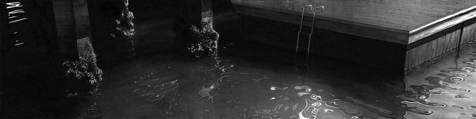
Living in Los Angeles you are surrounded by freeways, and interchanges.  Some of them are incredible, with what seems like hundreds of legs supporting the roads. If you look at the legs in this painting, they are actually quite complex shapes, and its interesting how they resolved the main leg and how it terminates at the top.  

I like the accelerated forms here, they lead your eyes into the distance.

AUTOMATON 5


This was an image I did for a tutorial that hopefully will come out in a few months.

Monday, June 25, 2012

INSTRUCTING AT THE ART CENTER COLLEGE OF DESIGN

I'm proud to say I will be instructing at the prestigious Art Center College of Design this fall on Saturdays.  The class will be Design Fundamentals 2, and will focus on avant garde ways of achieving designs, and delving into conceptual areas usually not common.
As a graduate of this school I feel privileged to return with knowledge I have gained over the last 23 years and help the next generation of designers.

Sunday, June 24, 2012

GRAPHILICUS IMAGICUS


I'm working here on trying to remove information, yet keep the freshness of the image.

Friday, June 22, 2012

BLACK AND WHITES


Here are some pen and ink illustrations.  I wanted to go deep in the blacks, with gradations in the mediums to give a rather severe graphics look, without them having too much information removed. The gradations are done with washes.

EVOLUTION OF A SKETCH


I don't usually spend too much time on sketches.  They serve one purpose, to get the basics down.  If I like it, then I'll work up a tight line drawing, then a finished rendering. The initial top sketch is only 1" wide. These are pen and ink and pencil.

Saturday, June 9, 2012

Tuesday, June 5, 2012

OLD TREE AND FIELD OIL PAINTINGS


The Old Tree: Here is another of my painful paintings. I seem to be drawn to complex images, the complexity here being the bark. So much subtlety in the color, and so many shapes. Also the mini twigs were endless, but I am happy with the result. This was 4' in width.

The Field: Here, again, was painful.  All the plowings in perspective and then the little shrubberies.  Hours of leaf painting. But again, I am happy with the result. Its all good practice and working in many different mediums teaches you a lot as an artist. This was 3' in width.

VALLEY OF FIRE DIGITAL PAINTING.


This was a painting I did by looking at a photo I took in the Valley of fire in Nevada, an incredible place.  Its good to practice using photos now and then as strict guides so that you can 'adjust' your memory to how light and atmosphere interacts with certain elements.  With a lot of my paintings I usually try to paint using difficult, detailed subject matter under bright, sunny, severe lighting conditions. That way nothing is hidden, everything needs to be touched and the hope is that what you are recording with your eyes in these conditions can be remembered for other, less harsher images.  Color matching can be very hard, and this can really teach you a lot, by looking, and matching. When I started this I underestimated the time needed to render each bush, and by the time I was done it was a great relief.

DIGITAL PAINTINGS 5


More studying of light and reflections and shapes.  Breaking down the images into their individual parts and removing information to see what holds up.

Monday, June 4, 2012

NEWTEK / LIGHTWAVE 3D BANNER FOR THE VISUAL EFFECTS SOCIETY CONFERENCES


This is a huge banner that will be flying above the Visual Effects society entrance to their conferences this year.  I am honored that Newtek, the company that makes Lightwave 3D which is the software I use has used part of my image CREN for the banner from my book PLACES, which you can purchase by clicking on the left link.

Sunday, June 3, 2012

VARIOUS COMMERCIALS 1


FIRST UNION BANK COMMERCIAL


This was the first project I Production Designed.  I was hired by ILM to design a series of 3 commercials that grew to about 8.  The scope was massive and utilized all ILM had in terms of visual and practical effects.  We used matte paintings, miniatures, CG, live action....you name it, it was there.  Unfortunately since 911 the money for these kinds of spots are few and far between.   The line drawings here I did as matte painting designs that would be handed to the matte painters who would paint a photorealistic rendition of these images. It was all a lot of fun.

REEBOK COMMERCIAL


THESE WERE ALL SKETCH COMPOSITES I DID FOR A BIG REEBOK JOB THAT STARTED IN BOSTON AND WENT TO BARCELONA.  ALL THE GYMS HAD TO LOOK DIFFERENT TO A CERTAIN EXTENT, AND ALL THE EQUIPMENT WAS PROVIDED BY REEBOK.  DRESSING A LOCATION WITH 1000'S OF POUNDS OF EQUIPMENT TAKES A WHILE. THE FIRST IMAGE WAS THE EXTERIOR OF A GYM WE MADE INTO AN ALLEY DUE TO TIME RESTRAINTS TO ACTUALLY TRAVEL TO AN ALLEY ON THE SHOOT DAY. THERES NEVER TIME TO DO GREAT ILLUSTRATIONS ON COMMERCIALS, BUT THESE DID THE JOB.